How to think about performance
Performance conversations fail on vocabulary long before they fail on code. This is module zero of a series on Node.js performance: latency, throughput, utilization, percentiles — and the three questions every investigation reduces to.
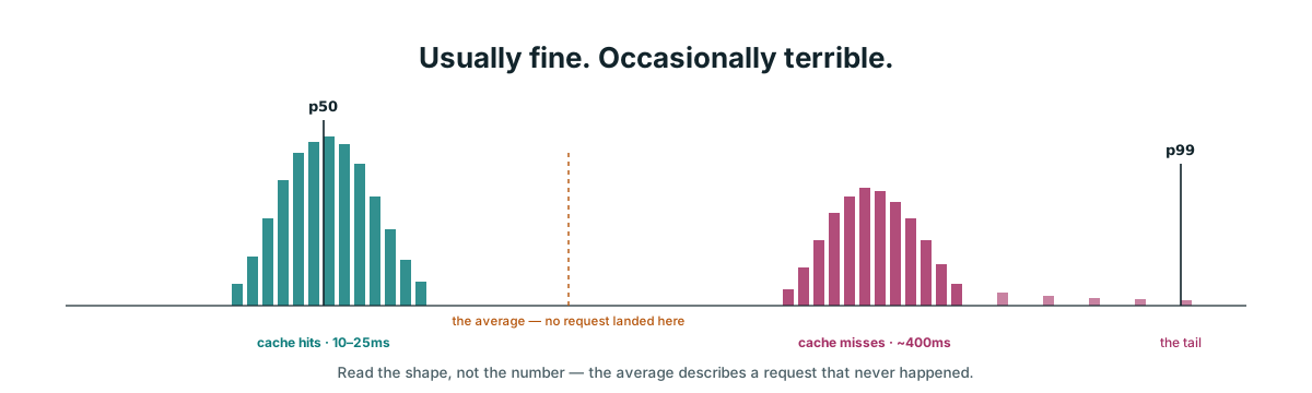
Here is the whole module in one picture — 1,000 real requests, sorted fastest to slowest. The labels mean nothing yet. By the end of this post you will read it fluently, because you will meet this exact service again at the end.
Three words that get confused
Latency
Throughput
Utilization
They pull against each other. Pushing throughput up usually pushes latency up, because more traffic means more waiting in line. So “make it faster” is not a real instruction. Faster for one user, or more users served?
The same split explains why fast code and a fast service are different claims. Fast code is one function running alone with nothing competing. A fast service is many requests sharing an event loop, a connection pool, and a CPU quota. The bottleneck usually lives somewhere nobody wrote.
Why the average lies
Take eleven requests and time them. Sorted, the samples look like this — milliseconds:
10 10 11 12 12 13 14 15 20 25 3000Ten requests sit between 10 and 25ms. One hit something slow — a cold cache, a lock, a GC pause — and took three seconds.
The average is the total divided by the count: 3142 / 11 ≈ 285ms. No request took anywhere near 285ms — the number describes a request that never happened. The median is just the middle one: count to the 6th of 11, 13ms. The outlier could have been three seconds or three minutes; the median stays at 13ms.
An average is sensitive to extremes. A median just sits in the middle regardless of how far the edges stretch.
What a percentile actually is
The median from the last section has a formal name: the 50th percentile — the value at position 50% of the sorted list. A percentile generalizes “the middle one” to any position: p95 is the value at position 95%, p99 at 99%.
The recipe is the same counting you just did, in three steps:
- Sort the samples.
- Cut the list into 100 boxes of equal count. Each box holds the same number of samples — you divide the count of samples, never the range of values. How wide a box is in milliseconds varies enormously.
- Read the boundary you care about.
Eleven samples is too few to see the shape, so the diagram scales up to 300 — three samples per box, with the p50 and p99 boundaries marked:
In code, the whole thing is a sort plus an index:
sorted = durations.sort(ascending)
p99    = sorted[Math.floor(sorted.length * 0.99)]
The mistake to avoid. A percentile is not “how bad does it get.” It is “count to this position.” The worst number in your data is the maximum — a far less useful statistic, because a single sample decides it.
Percentile vs histogram
The recipe above has a hidden assumption: it keeps every sample, sorted, ready to index. That is fine for eleven requests on your laptop. A production service serves millions of requests a minute — you cannot store them all, let alone sort them on every query.
So production systems store a histogram instead: cut the range of values into fixed buckets — 0–30ms, 30–60ms, and so on — and keep only a counter per bucket. Notice this is exactly the division a percentile refuses to do. A percentile divides the count; a histogram divides the range. Cutting different things is what makes them easy to confuse:
The counters are all you keep, so a percentile becomes a query against the histogram: count forward through the buckets until you pass 99% of the total. The histogram is the storage; the percentile is a query against it. This is exactly what Node’s monitorEventLoopDelay hands you — Module 2 of this series puts it to work.
The tail is not rare
You now have the vocabulary and the instruments. The rest of this module is about the ways they fool you — starting with the part of the distribution everyone is tempted to ignore.
Percentiles invite a comforting reading: p99 sounds like an edge case, a rounding error, one percent of requests. Do the arithmetic. At 1,000 requests per second, p99 is 10 slow requests every second, all day.
And it compounds across fan-out. A page view is rarely one request — say it makes five backend calls, each with a 1% chance of being slow. The page feels fast only if all five come back fast:
chance the page feels slow ≈ 1 − (0.99)⁵ ≈ 5%Fan out further and the tail becomes the typical experience. Twenty calls — a common count for a backend-for-frontend (BFF) assembling one screen — and 1 − (0.99)²⁰ ≈ 18%: nearly one page view in five feels slow, with no single service misbehaving. This is why the BFF is the danger zone — a later module does the real math.
Bimodal distributions
You have already met the next trap. The eleven samples from earlier — ten requests at 10–25ms and one at 3,000ms — are not one hill with a long slope. They are two separate populations: the fast path, and the path that hit something slow.
Real Node services rarely have one hill. They have two clumps — cache hits around 15ms, cache misses around 400ms:
Nothing got slower. Only the mix moved — more misses, as the cache was flushed or the traffic shifted — and p50 jumped twenty-six-fold.
When a percentile jumps sharply and neither code path changed, suspect that a boundary slid across the gap in a bimodal distribution. Chase the mix, not the number.
This is also why load-testing against a warm cache is dishonest: you only ever sample the left clump.
Two rules that catch people out
Percentiles, tails, mixes — the tools are simple, but they are easy to quote badly. Two rules cover most of the damage.
Never quote one percentile alone. p50 hides the disaster; p99 exaggerates the routine. p50 22ms / p99 900ms tells a complete story: usually fine, occasionally terrible, go find out why.
Never average percentiles. Server A at p99 100ms and Server B at p99 200ms does not give a fleet p99 of 150ms. You have to merge the underlying histograms.
And a corollary about sample size — the deeper into the tail you go, the fewer requests decide the number:
| Samples | p99 is decided by | Verdict |
|---|---|---|
| 100 | 1 request | noise |
| 300 | 3 requests | shaky |
| 100,000 | 1,000 requests | solid |
Short load-test runs produce p99s that swing wildly between runs. Run longer — a later module returns to this.
Workload thinking
Everything above describes a service under one fixed load. Change the load, and every number in this post moves — because there is no fast service. There is a service plus a workload.
The workload has four dials: request rate (how many arrive per second), concurrency (how many in flight at once), payload size, and traffic shape (steady, daily rhythm, or spiky). Turn any one and the same code moves from comfortable to failing.
A load test without a workload model is theatre. You are measuring a real service against a fantasy.
Utilization is not linear
The gauge at the top of this post sat at 78%. The natural reading — “78% used, so 22% of room left” — is the wrong intuition.
Below the bend, extra load is nearly free. Past it, small load increases cause enormous latency increases, because arriving work keeps finding the resource already busy and has to queue behind it. At 78% you are sitting at the foot of that bend — 10% more traffic can double your p99.
A wide p50/p99 gap is the signature of queueing, not of slow code. A later module explains the shape properly with Little’s Law.
One caveat: OS-level CPU% is a mediocre signal for Node. It cannot tell “doing useful work” from “event loop blocked.” A later module replaces it with event loop utilization.
The three questions
Everything so far — the vocabulary, the percentiles, the tails and clumps, the queueing — reduces to three questions you can ask in front of any dashboard:
Memory is on the list even though this module never touched it — investigations that skip it rediscover it the hard way, and a later module gives it proper instruments. If you optimise anything that is not the constraint, you have worked hard and changed nothing. Everything in Modules 1 through 6 is just better instruments for answering these three.
Two checklists
The three questions, packaged for the field, are two checklists. USE for resources — utilization, saturation, errors. RED for services — rate, errors, duration:
Saturation is the early warning. Utilization tells you a resource is busy; saturation tells you work is piling up behind it.
Hold onto RED — the closing checkpoint asks for exactly those three numbers.
Worked example
One service, end to end, using everything above. 1,000 requests over one minute — Express API in front of Postgres.
- 940 requests at 18–25ms — warm pool connection, served immediately
- 55 requests at 200–240ms — waited for a connection to free up
- 5 requests at 2100–2400ms — waited, then hit a slow query
Notice the shape: two clumps, plus a tail — the bimodal picture with real numbers. It is also the sorted strip from the top of this post, now with the story behind it. Read the percentiles by counting to the index, exactly as in the recipe:
| Metric | Index | Lands in | Value |
|---|---|---|---|
| p50 | 500 | fast band (0–939) | ~22ms |
| p95 | 950 | pool wait (940–994) | ~230ms |
| p99 | 990 | pool wait | ~240ms |
| max | 999 | slow query | ~2400ms |
| average | — | — | 46ms |
The dashboard shows 46ms against a 100ms target. Green. Passing. Meanwhile 6% of requests take 200ms or more.
The service is already failing its intent while passing its metric. That is Module 0’s entire argument in one number.
Checkpoint — paper only
Write down what you believe today’s rate, errors and duration are for a service you operate — an Express + Postgres API, a Next.js app with its BFF, whatever you own. Guess, and commit the guesses to a file.
When real numbers arrive, the gap between guess and reality is itself a finding — and a good story to present. The next module starts from that file: instruments, not guesses.